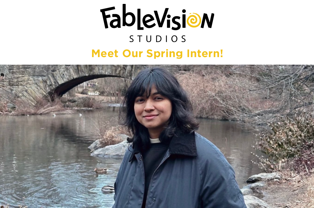
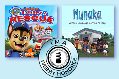
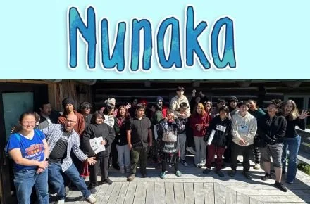
Kirra’s yellow chick that changed it all.
Everything changed with the chicken. It was the fall of 2021 and designer Jamie Griffin had just delivered her latest batch of possible new FableVision logo options. A Slack message popped up from FableVision President and Co-Founder Gary Goldberger —“Oh my god, did you see the chicken?” Just another morning at FableVision.
In January, we revealed FableVision’s 25th anniversary makeover by showing off our new logo. Today, we’ll take you behind the scenes of FableVision’s new look and share how a young artist named Kirra became the breakthrough surprise of our rebrand story.
When Peter. H Reynolds, Paul Reynolds, Gary Goldberger, and John Lechner founded FableVision in 1996, Peter designed the studio’s original logo. We’ve always had a soft spot for nostalgia, so he went for a “retro” or “diner-esque” vibe that featured his signature handwriting. The orange and yellow bursts came from the design software’s “star shape” tool and brought some energy and movement to the logo.
Our original logo, designed by Founder Peter H. Reynolds.
We love Peter’s original logo—it served us well for 25 years! As FableVision grew, evolved, and expanded its projects, we decided to honor our anniversary with a fresh look. We invited graphic designer Jamie Griffin, a friend of the studio, to help us explore a new look, while remaining true to who we are.
“I generally approach branding projects by first gaining an understanding of what the client is all about,” says Jamie. “If the project is a brand redesign, I find out what is working and what it is about the current brand they want to change. From there, I have a good foundation to start exploring ideas and solutions for a logo identity that is unique and memorable, and creatively represents who they are.”
We wanted to address a few things in our rebrand. “Over the years we'd received a few lighthearted remarks around people having a hard time reading the cursive, mistaking the F for a T—which would read TableVision,” says Bob Flynn, FableVision’s Director of Art and Animation. Therefore, we focused on improving legibility and creating a logo that works well on both white and black.
Our new logo!
“I was tasked with the following goals,” says Jamie. “I needed to keep the ‘hand of the artist’ feel, make the logo more legible, modernize it a bit, keep it fun and playful, explore a burst-like element, develop an ‘FV’ mark, and add the word ‘studios.’”
As Jamie researched, sketched, and brainstormed, and we weighed in on her suggestions, we decided on a typographically playful option. This helped with legibility, while staying fun and creative. She incorporated the word “studios” and suggested a gray background, that our team later turned into a gray burst, to recall our original red, orange, and yellow starburst.
We love the gray burst and swirl icon for the “O.”
In one of our early sketches, Jamie explored replacing the “O” in FableVision with various doodles. “The next step was to explore ways to incorporate a hand-drawn element using the ‘O’ in FableVision and pushing the playfulness of the typography even further,” explains Jamie. She sent a few options for consideration. Among them was the gold swirl you see here. “Through this collaborative process, we created the swirl icon for the ‘O.’ It pays homage to FableVision’s use of watercolors throughout the years and the ‘hand of the artist’ aesthetic that FableVision loves so much.”
Jamie had also shared a chicken, a baby yellow chick, as another option to replace the “O.” We couldn’t stop talking about it and when we asked her the story behind it, we found out that her daughter Kirra, a 15-year-old high school sophomore, designed it.
“I was always encouraged to draw from a very young age and I’ve always loved drawing,” says Kirra. “I like to try out all different styles of art. I started making art as soon as I could hold a pencil—I can’t really remember not drawing.”
It was amazing to work with Kirra and watch her make her mark. We’re lucky to collaborate with young people during various co-design sessions on our projects, but to have her as part of our logo redesign process was the icing on our rebrand cake. We asked Kirra if we could see more of her doodles. That opened the door for a dynamic, rotating “logo icon” as Kirra shared her creativity and spark with us, and helped lead FableVision to its future.
Some additional doodles that Kirra drew for us as we workshopped the dynamic logo.
“I designed the chick, the flower, and the planet, and the chick is my favorite,” says Kirra. “I enjoy doing art as a hobby and it is something I’m interested in as a career. Listening to music while I create art is my main inspiration.”
Kirra’s flower and planet incorporated into our dynamic logo.
Our 16 icons – stay tuned for more! Can you spot Kirra’s drawings?
And we were certainly inspired by Kirra. Using her many designs as a starting point, we developed 16 changing icons. Sometimes our logo features Kirra’s joyful, pink flower, and other times it incorporates a silly, neon alien.
We have more logo icons in the making. Keep checking in with us for fun icons that depict holidays, seasons, or favorite animals that are designed by our staff and creative community. “The beauty of the dynamic logo is that it gives us flexibility and reflects the joy and humor that we bring to our projects, while keeping our audience excited for more,” says Gary Goldberger.
And voila – after many discussions, sketches, designs, and brainstorming sessions, we love our new rebrand and are thrilled to keep sharing it.
We’re only 25 years into our 200-year mission and we’ll continue expanding our studio, partnerships, and offerings. We cannot wait to keep breaking through educational challenges and inspiring young learners – stay tuned for new logo icons and new projects!
Surprise! Here’s a brand new 17th icon that we just designed.
